To keep the designs between my prototypes more consistent, I decided to change the design of my language tiles to incorporate the same visual elements. It was a rather straightforward process as I just had to bring the design over from my second prototype and adjust the scaling so that it fits the word nicely. With the new designs done, I followed the exact same process I did for the 3D printed language tiles in Blender and modelled it for 3D printing.
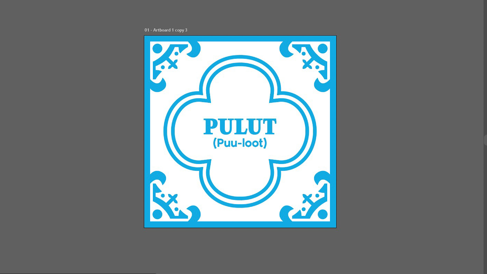
The new design of the language tiles
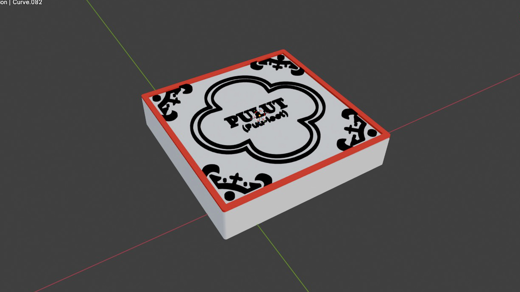
Modelling it in blender
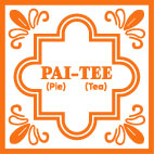
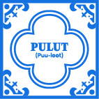
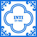
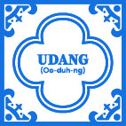
I decided to keep the words and artifacts within the context of Kuehs (Peranakan snacks) so as to keep the theme consistent. I kept the word "Ang Ku Kueh", but added 3 more words that represents kuehs which are "Kueh Pai Tee", "Pulut Udang" and "Pulut Inti". I decided to also segregate them into two groups with distinct colors.
The words "Ang Ku Kueh" and "Kueh Pai Tee" have the common word "Kueh" in them thus they are grouped together.
"Pulut" means glutinous rice in Malay, and this line of kuehs involve glutinous rice as their base. "Pulut Inti" and "Pulut Udang" are both an example, and also have the word "Pulut" in them so they are grouped together.
Keeping in mind the feedback I got during open studios on the topic of making the tiles interchangeable, I decided to make it so that some words (Kueh and Pulut) can be used more than once and in different positions (for kueh only). This makes the interaction feel more versatile and also reduce clutter in the interface as lesser tiles are needed.
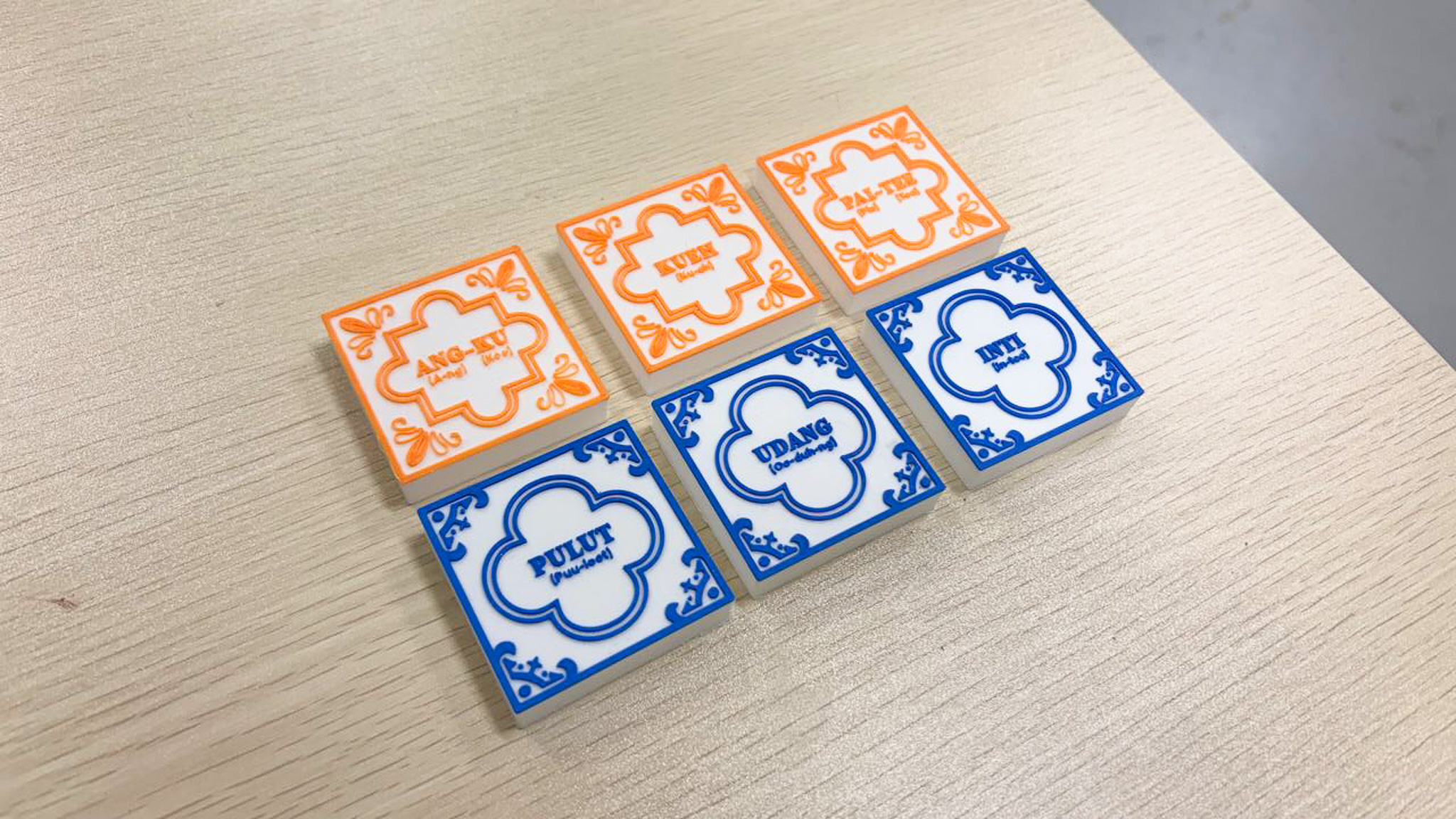
With the designs finalized, I sent the tiles for printing to my friend again (Thanks Jone!) to help me 3D print with a 0.2 nozzle. I got back the tiles the next day thanks to his help. I really liked how the final design turned out. The blue color really looks similar to the blue used in vintage ceramic pottery! Below are some evaluations I made of it, but I think this part is done!
Compared to the fully black test print, adding colors really made it so much more easier to read the syllables. On top of that, the colors also make it easy to distinguish between the two different categories of Kuehs.
My previous black iteration used mostly outlines and strokes on the textures. With the new design, there were more solid, filled shapes, which I felt make the tile design look more robust and visually dynamic. No surprise since this mimics the designs of real tiles.
I wanted to go for red but I felt it would contest with the blue too much, thus orange it was. However, I feel that it is a tad bit too bright and is abit hard to see. But the color complements well with the blue so it works!
With the physical interface done, it's time to go back to the digital interface. I needed to import the 3D models of the new words that I have added into TouchDesigner and also changed their description texts. To get the 3D models looking good as it is, there were a few things I needed to do, which was quite challenging initially.
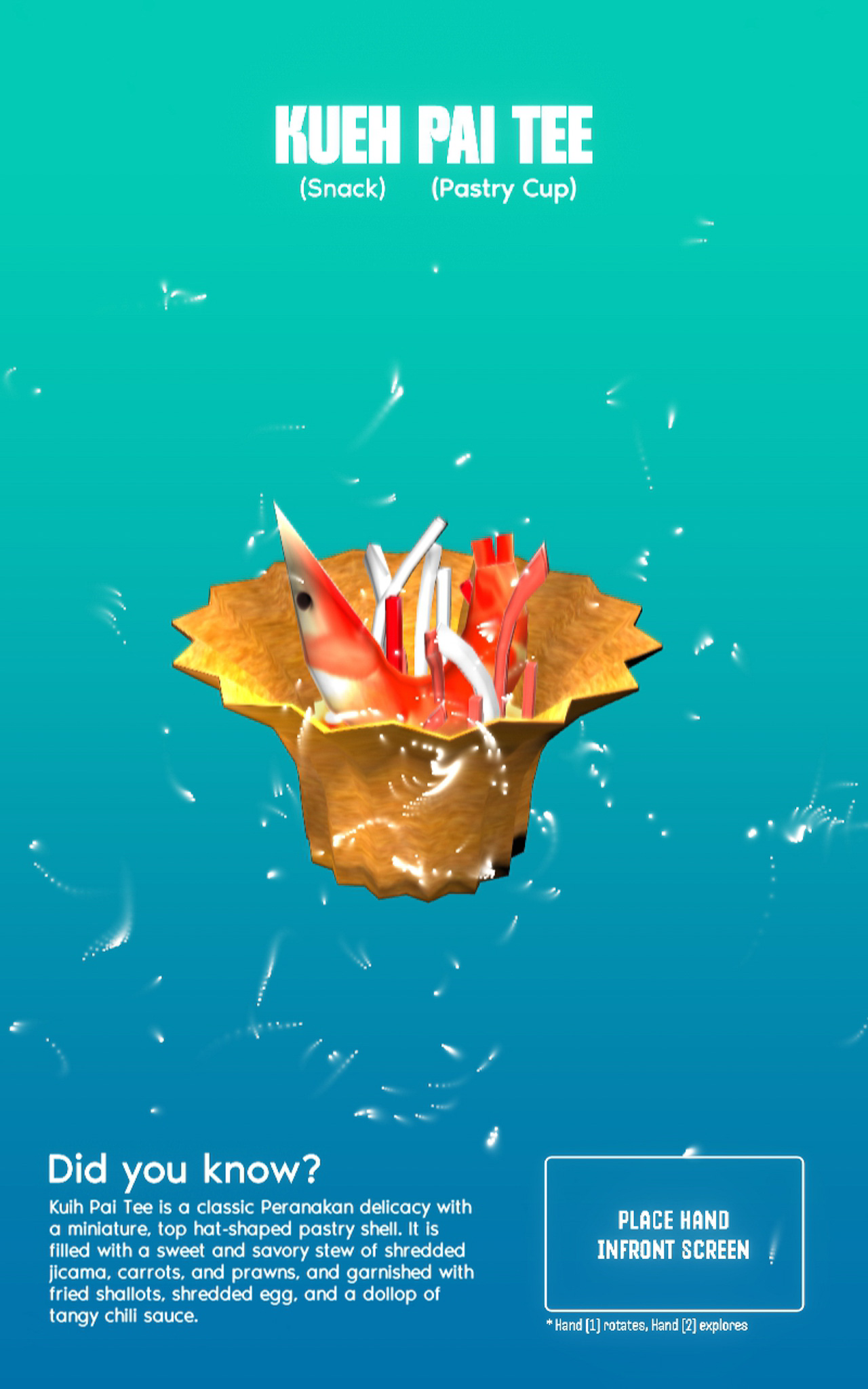
I needed to adjust the position of the lighting in TouchDesigner as well as its intensity to make sure that all sides of the 3D model looks well lit. Some areas of the model had curves and dents, which I figured I needed to add more light source to make it better lit.
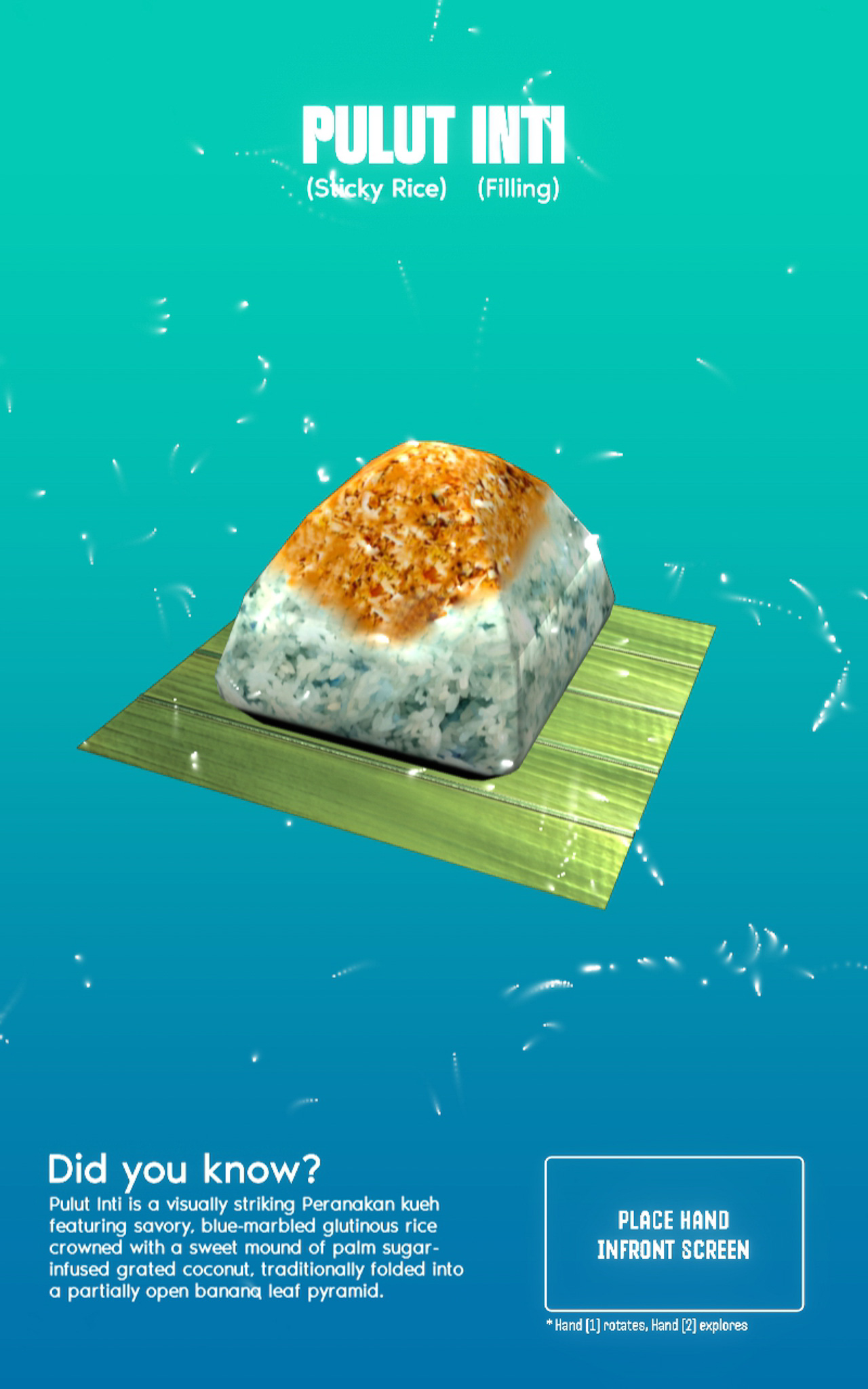
When I assigned the materials to the 3D models in TouchDesigner, I needed to fine tune the saturation and the texture protrusions to make it look good for screen, but still true to the original kueh that we see everday.
I also had to rotate and find which angle the artifact looks good and clear in. This might seem simple but took me a good half an hour for the three new models!
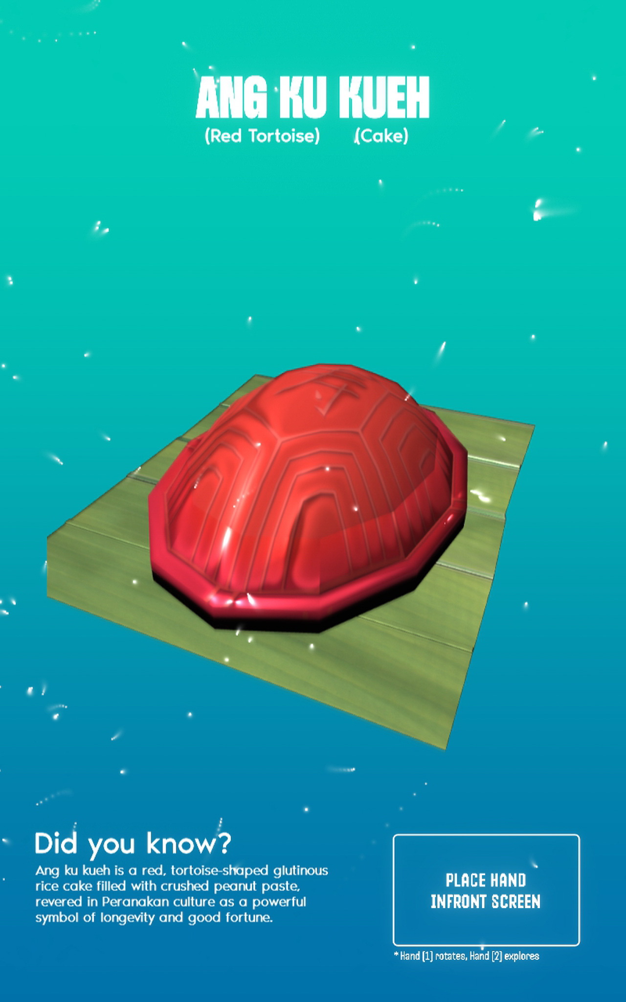
The new set of 3D models
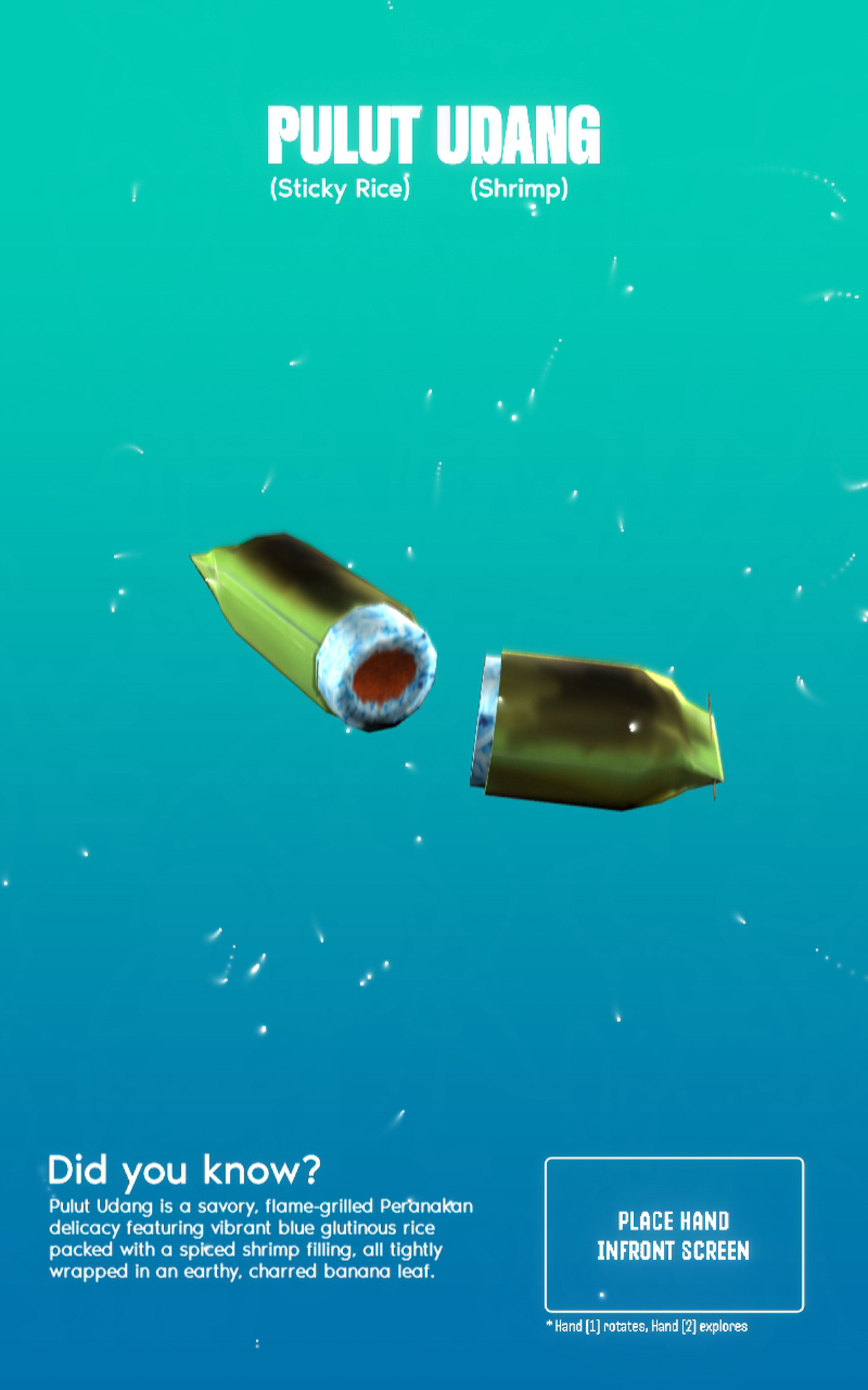
Taking in account the feedback I got for the "exploding" 3D model idea, I decided to work on it by integrating a secondary gesture that allows users to select specific parts of the 3D model they want to explore. For this to work, I had to achieve two things.
I needed to be able to separate and translate the individual ingredients of the kueh. To do this, I separated the different parts in Blender and re-imported them into TouchDesigner. This then allowed me to rotate, translate these specific parts independently.
To make the gesture work, I used mediapipe to record the Y height of the user's second hand finger tip. I then mapped this data to make it so that the Y height controls the translation of the model's individual components.
To further facilitate the educational aspect of this interface, I made it so that each translation of the specific ingredient will trigger a pop up text that explains what the ingredient is. I believe that presenting the text in this manner (individually upon selection) makes learning much more digestible. It's inspired by my trip to Exploria and the way I saw them present information in bite-sized formats (see my reflections here about my trip).
-
Using Second Gesture to dissect the model (pardon my camera brightness!)