Peranakan Tile with Victorian-styled Design
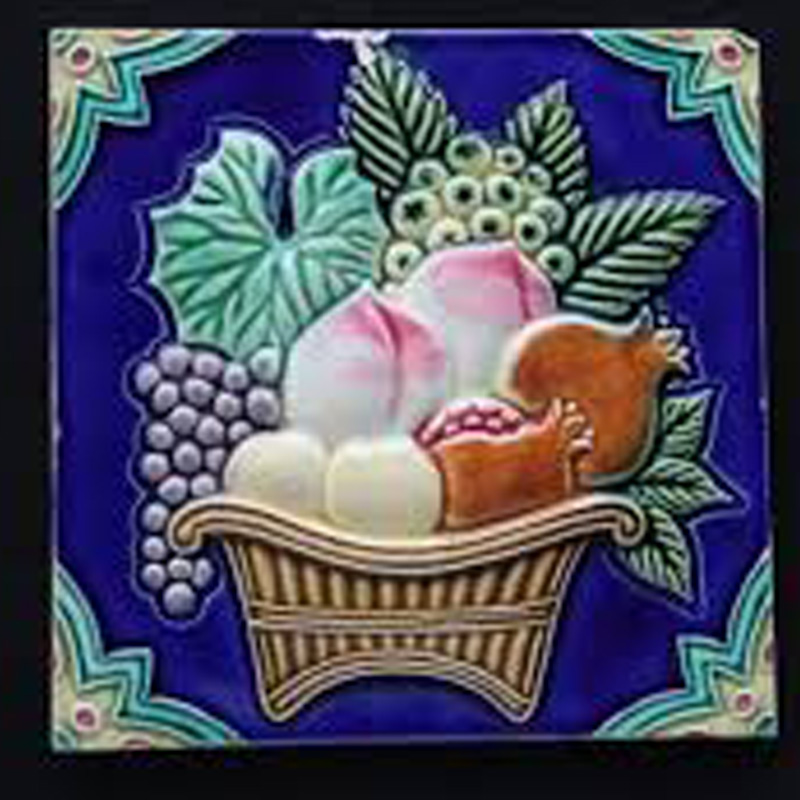
Peach motif tile
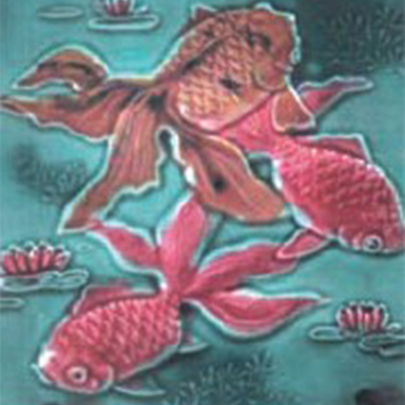
Gold fish motif tile
As I move into redesigning the tiles, I needed to establish a good understanding of the stories behind its design to be able to design it well. I came across a publication by the Peranakan Association in Singapore that writes about its rich culture and history.
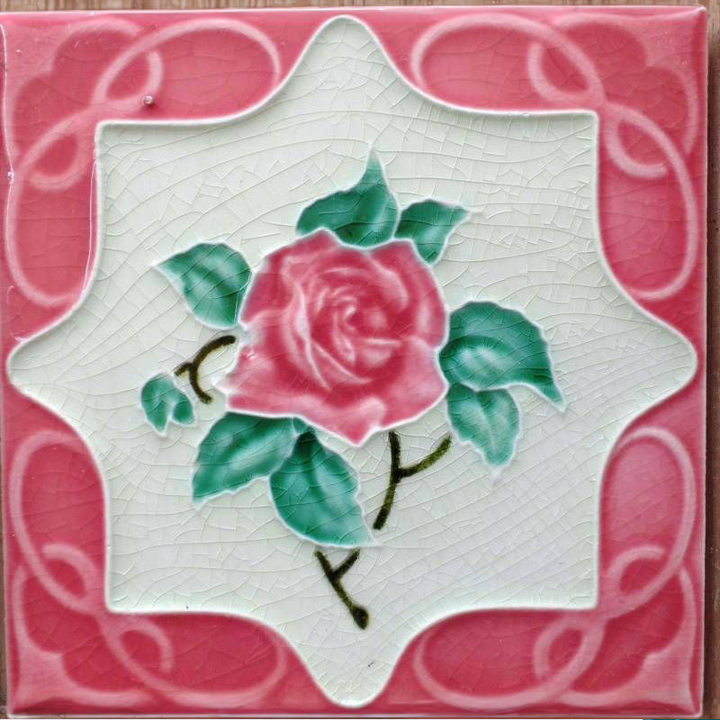
Ceramic wall tiles were common in Peranakan houses back in the early 1900s. These prevalence in their use lead to it being labelled as the the term "Peranakan Tiles". However, these tiles have varying origins, ranging from Chinese, Malay to European roots. Some of these tiles were imported from places like Britain, France and Japan, reflecting the diversity of the Peranakan culture and their cohesive integration of different cultures. Unfortunately in modern times, the use of these tiles have became a rarity, leading to limited supplies.
Information provided by The Peranakan Association, link is here.
The central motifs in the design of the tiles carry varied meanings. For example, tiles with peach motifs symbolizes longevity, while tiles with gold fish motifs symbolize abundance. Hence, flower, fruit and animal were very popular in Peranakan houses due its belief that it carries good fortune.
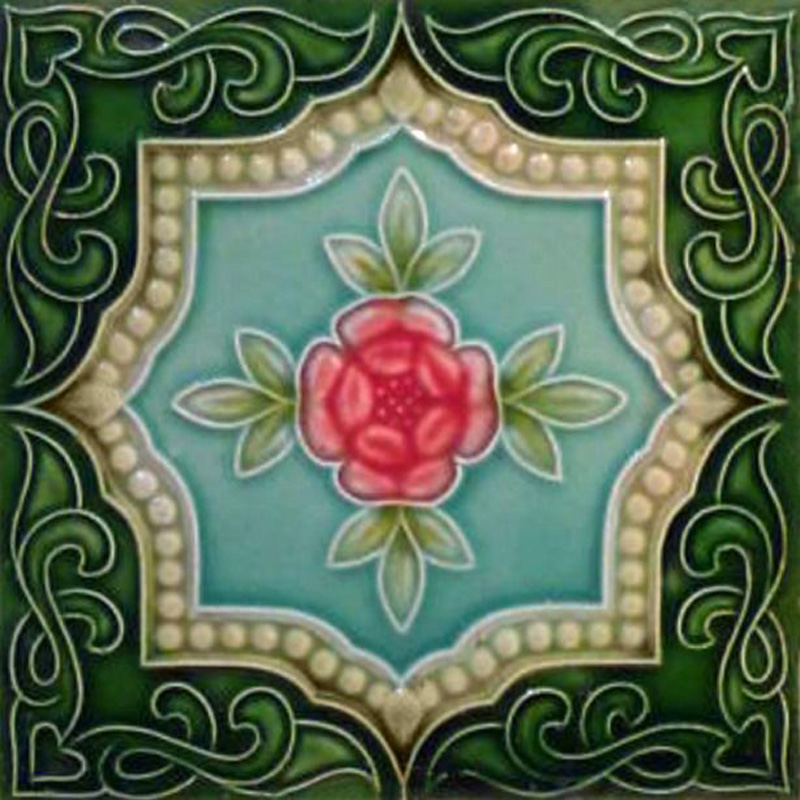
Since the Peranakans import most of their tiles, they also adopt much of the visual aesthetics from other cultures. Victorian tiles are one such example, where its unique symmetrical visual style shines through its presence in Peranakan homes.
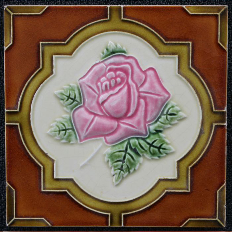
Stepped Quadrefoil frame
Art Noveau Frame Design
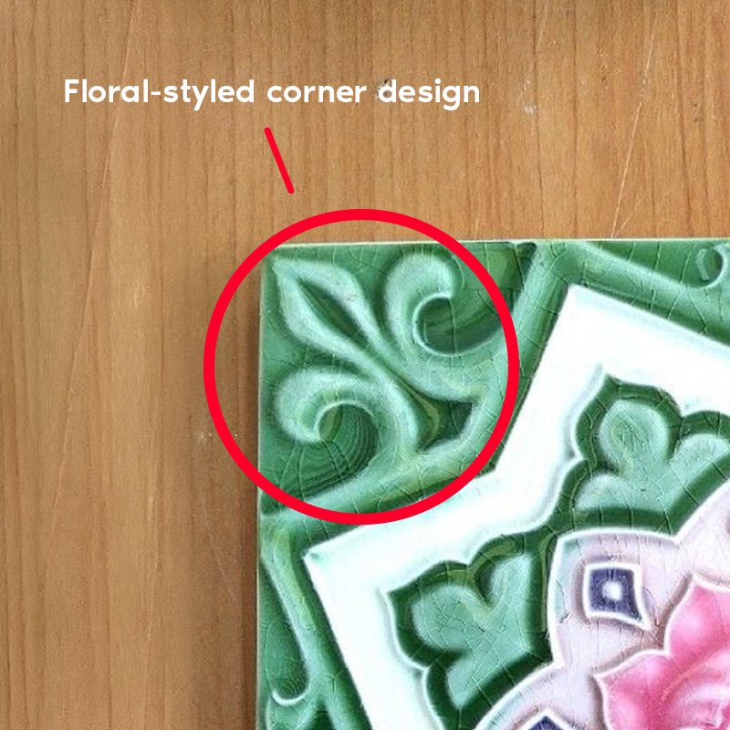
Floral styled corner design
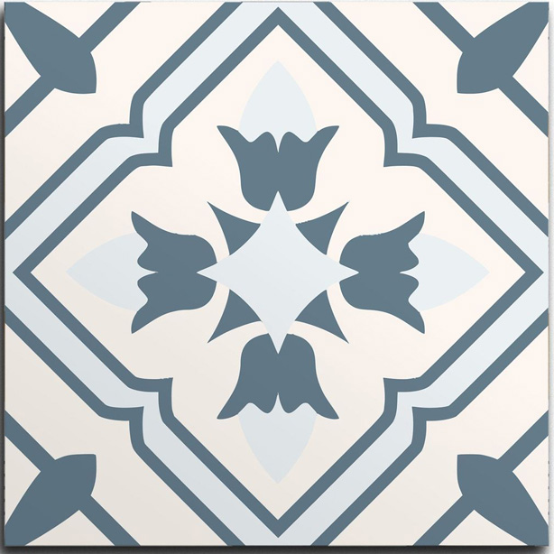
Geometrical Design
I moved on to studying the visual characteristics of the Peranakan Tiles, particular its center frame and corner designs. Here, the center frame refers to the white center shape that contains the main motif. I am not studying the center motifs visuals for now as the center of the frame will be occupied by the Baba malay syllables. I noted two things.
I found out that the left most image had a frame called the "Stepped Quadrefoil", where it has sharp angles that interrupts its otherwise smooth curves. The second frame design had a Art Noveau inspired aesthetic, where its frame mimics cartouche frames with irregular and flowy curves.
I noticed that some Peranakan tiles had corner designs that resembles floral shapes and form. The shape often mimics that of a leaf / flower, with smooth, organic curves that flows.
Peranakans also use geometrical and symmetrical tiles for their floorings. These tiles are called "Encaustic Tiles" and often consists of geometrical shapes that mirrors on four sides, creating symmetry.
New design with referenced elements
Corner design shows the object
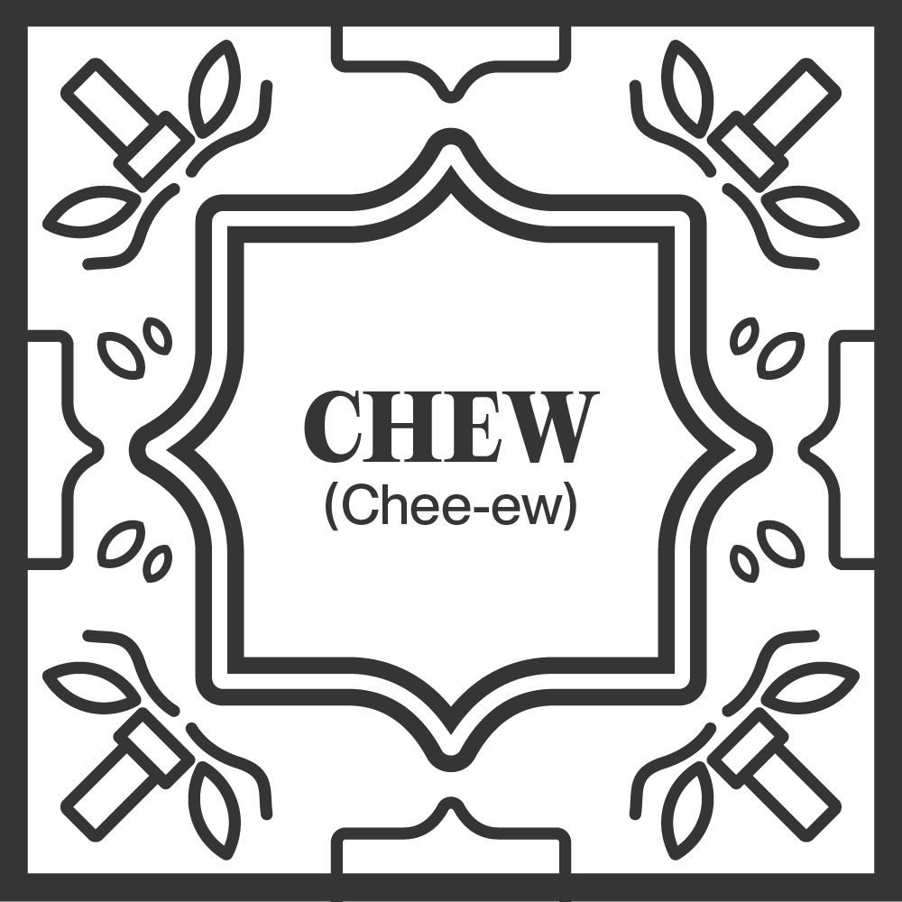
Different design for second pair
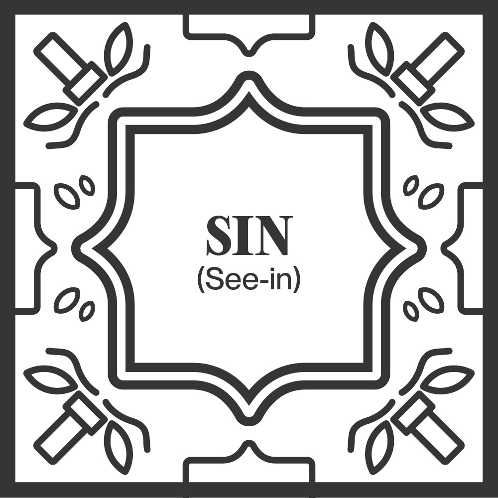
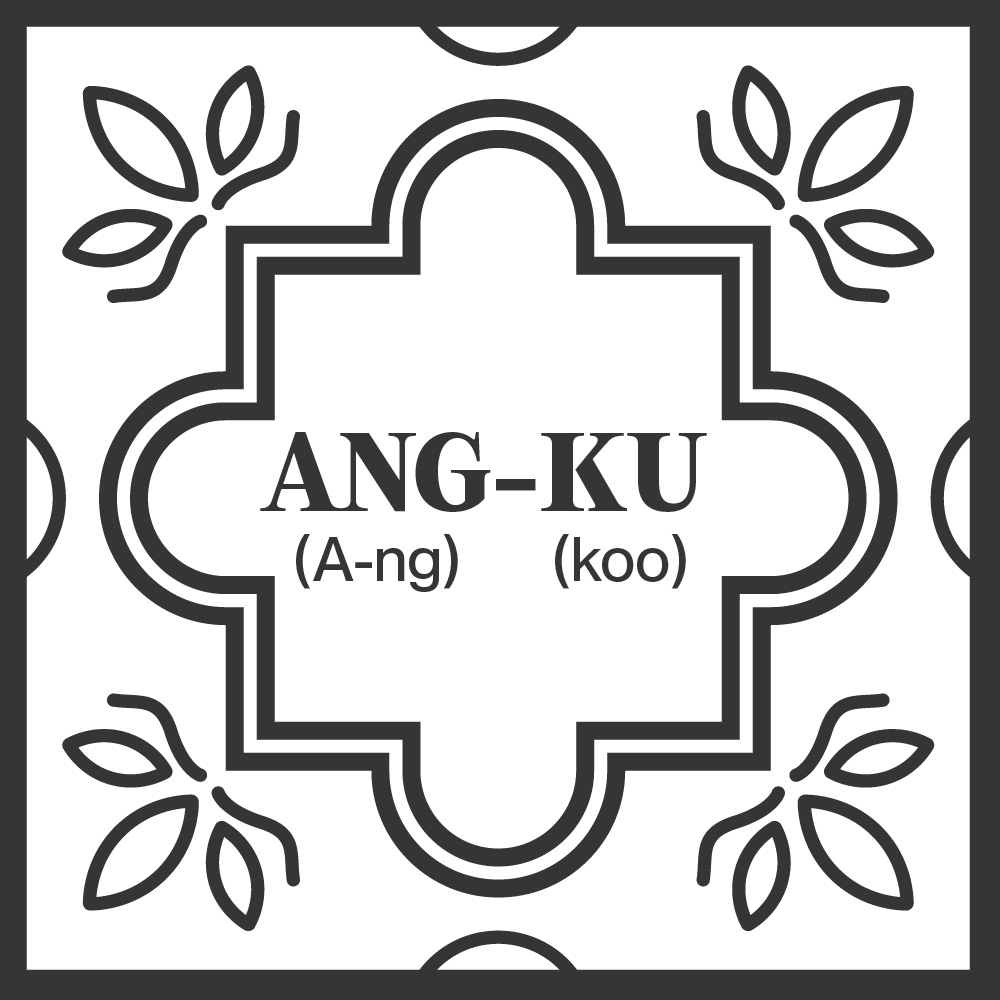
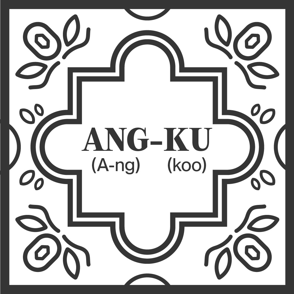
"Sin" Tile
With the above references, I started to redesign my language tiles. I started by incorporating the frame shapes into the design, and added in the floral corner designs. To recreate the geometrical aspect of the tiles, I used circles at the four edges to emphasize symmetry. Since they belong in pairs and represent different artifacts, I decided to make their designs distinct by giving each of them different center frame and edge designs. I also slightly tweaked the corner designs to show a icon of the artifacts that they represent as a little easter egg!
I felt that it actually is going in the right direction in terms of visual aesthetic (hopefully!). The incorporated elements gives a subtle nod to the visual elements present within Peranakan tile designs. However, a slight worry I have now is how it will look like in 3D (will it look too cluttered? or are the lines too thin?). Therefore, the next step for me next week is to head into 3D modelling and check out how it looks.