Reviewing the feedback for my dissertation draft and also self-evaluations, I felt that the pillars in my literature review needed to be strengthened with more readings/concepts and maybe even a full restructuring. This is due to two main issues: (1) there is a lack of content within my pillars, and (2) the current pillars are too technical and vague in its relevance to my project. As such, I have spent the past few days reading up and restructured my pillars to better align with my research direction as shown below.
The first pillar establishes a foundational
understanding of how actions, sensory perceptions, environment and tools affect our
cognition. For example, the concept of Embodied Cognition explores how physical
actions and interactions can assist in cognitive processes, while the concept of Embedded Cognition
looks into the impact of environment and social-cultural circumstances.
These foundational
understanding is crucial in our design process as we seek to design interactions that better align
with our embodied manner of cognition.
The second pillar looks into design principles and
frameworks that have the capability to leverage on the understanding of cognition discussed
in the previous pillar. For example, we look into concepts such as Tangible User Interfaces, which is
a design framework the explores the possibilities of manipulating digital data with physical objects,
like a box.
Under this framework, the box replaces the conventional keyboard and mouse input,
and
provides new possible interactions that can be used to tapped into Embodied Cognition.
The last pillar explores how we can design our interfaces
to provide our users an engaging and enjoyable experience. The Flow Theory we discussed in
the previous week is within this pillar, where we explore how we can encourage users to enter a state
of Flow in our interface experiences.
On top of this, I also reference the Model of Engagement
framework, which details the different stages in user engagement and key considerations for each
different stage.
Brave NUI World by Daniel Wigdor and Dennis Wixon
During my readings for pillar two, I came across the design framework known as Natural User Interfaces (NUI). The core idea of NUIs lies within its emphasis on designing interface interactions that allows users to "act like a natural" or a "expert" even during their first encounter with the interface. As such, it is important to design interface interactions that are intuitive and leverage on common human behavior. Below are some key points from this reading.
The design of these interfaces involves the integration of interactions that are grounded within real world context. Gesture inputs are a good example of this. For example, users can utilize a grabbing gesture (enabled through technology like Kinect Sensors) to hold onto a digital box and move it around. This interaction is rooted in our real world understanding as we often physically grab items to manipulate. Therefore, this intuitiveness helps people become a "expert" when using the interface.
Human's interaction with the real world often are multisensory, something in which conventional keyboard and mouse inputs struggle to effectively activate. As such, integrating the approach of NUIs to design interface interactions, such as the gesture example earlier, engages the different senses of the human body in a similar manner as real world experiences, ultimately contributing to a more intuitive interface experience.
While it might seem that mimicking real world interactions within interfaces is effective, it is however not the case all the time. Certain gestures that are intuitive in real life might not be inherently intuitive when translated to a digital experience. In the example of handwriting, while it is a intuitive gesture, it can face issues with letter recognition due to differences in people's handwriting, leading to frustrating user experiences. Therefore, it is also important to understand technological limitations and design with them in mind.
Despite the efficiencies of NUIs, it faces some limitations in translating real world gestures into certain functions of digital tasks, such as Cut and Paste. As such, Vatavu proposes the framework of Non-Natural User Interfaces (NNUI), which is a interface design framework that explores the integration of non-literal and non-intuitive interactions to enhance usability and promote user reflection. In the same "Cut and Paste" example, NNUIs framework would encourage the use of non-literal gestures like slicing with a finger or pushing forward with a hand to execute the Cut and Paste functions. While NNUI's framework feels like a direct opposite to NUIs, it is actually viewed as two cohesive sets of interface design frameworks that work together, excelling in areas that the other might not be particularly strong in. I will show an example of this cohesive integration in my next prototype! Below are some key learning points from this reading.
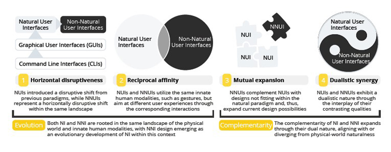
Relationship of NUI and NNUI by Radu-Daniel Vatavu
While it focuses on creating non-intuitive experiences, it's designed interactions
are still rooted within real world context, similarly to NUIs. The difference lies in the
deliberate
choice of integrating gestures that are unconventional in the context of the interface design. Vatavu
created an interface interaction as an example, where participants get to "store" digital files within
the physical pockets in their clothings and retrieve them by grabbing them out of the pocket (using
kinect sensors).
In this example, storing items within our pockets is a familiar experience
rooted in real world context, but when applied into the context of storing digital files, it gives an
supposedly non-intuitive experience that promotes reflection.
NNUIs creates thought-provoking, reflective experiences
through the integration of
unconventional interactions and interface feedback. This integration of unconventional
interactions
also promotes new forms of expressions, further making NNUIs experiences more memorable and expanding
the interface's design possibilities. Another example of a unconventional interface interaction can be
through the omission of audio feedback within the interface.
In the same "digital data pocket"
example, by omitting the audio feedback when users store the digital file in their pocket, users have
to rely on their memory to remember that they have stored the file, ultimately prompting user
reflection.
Incorporating non-intuitive interactions is a design process that should be meticulously planned and considered.The designed interactions should emphasize on functionality, ensuring that these unconventional interactions do not confuse users and affect the overall usability of the interface. In the same "digital data pocket" example, while we omit audio feedback, we must consider whether it will affect user's usability and consider enhancing the visual feedback of when the "digital data" is stored within the pockets, like adding a bright glow or some dynamic animations.
With the lessons from prototype one, I moved on towards my second prototype based within the context of the Peranakan language, Baba Malay. To reiterate, Baba Malay is the cultural language of the Peranakans that involves the mixture of both the Malay and Hokkien language (mentioned before in Week 2). In this interactive experience, users pair mini Peranakan tiles, each with syllables on its face to form a word in the Peranakan language. Once formed, a visual appearance of its 3D model representation appears on screen, where users can manipulate and view using simple gestures (pinch to zoom and slide to rotate).
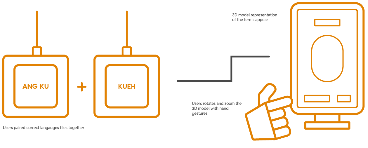
The user interaction plan for Prototype Two
Inspired by the readings, I saw an opportunity to integrate both NUI and NNUI's design framework within my prototype. I broke it down how I came to it below.
To design intuitive interactions that users understand instinctively and use with ease.
The concept of the experience's interaction mimics our natural cognitive processes of forming words, where we piece syllables together mentally and recall a visual representation of them. Hence, the overall user experience with the interface will feel familiar to its users and allow them to interact with ease.
To integrate unconventional interactions that enhances usability and encourages reflection.
The approach of NNUI creates a physical representation of our natural language cognitive processes, where users now piece the syllables physically together and visually observe the 3D model representation that appears on screen. This unique physical presentation of our mental processes provides a novel experience that piques users interest.
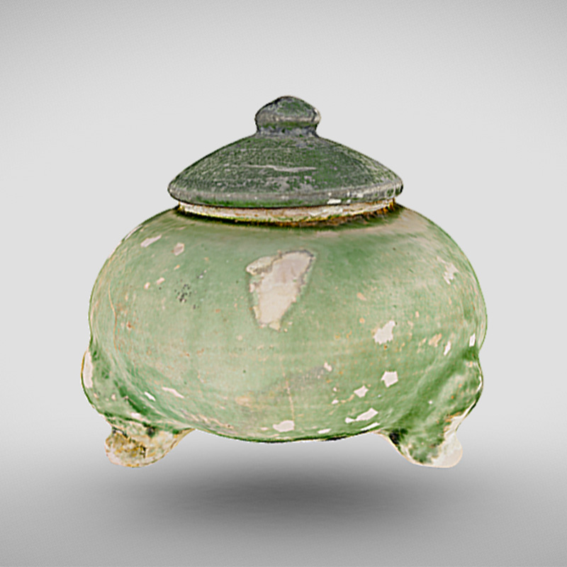
To begin the making process, I decided to source some 3D models of Peranakan artefacts as a reference for my visuals. A key influence to this decision is due to the fact that using 3D models as a reference will create an outcome that feels more like an accurate representation of the actual artefact. Initially, I was happy to come across the Sketchfab account by National Heritage Board (click for link), where there was a variety of 3D model artefacts of the Peranakan heritage. Unfortunately, the models were not available for download, so that was a bummer. Luckily, I managed to find two open-source 3D models for two Peranakan artefacts: (1) Ang Ku Kueh, a peranakan snack, and (2) Sin Chew, a religious ancestral tablet.
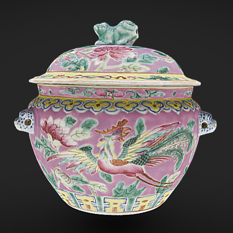
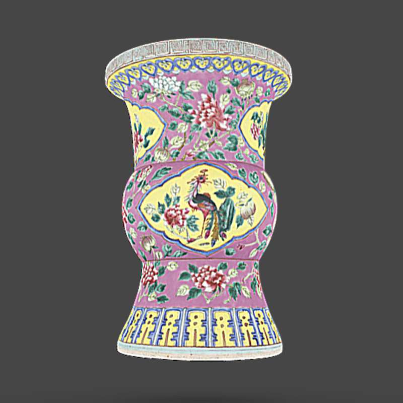
3D models of Peranakan Artefacts from NHB (not available for download)
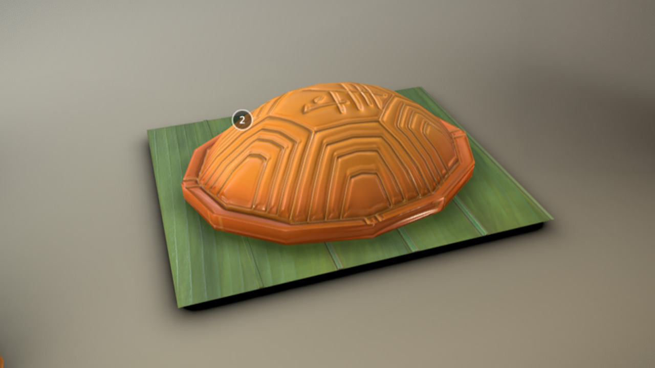
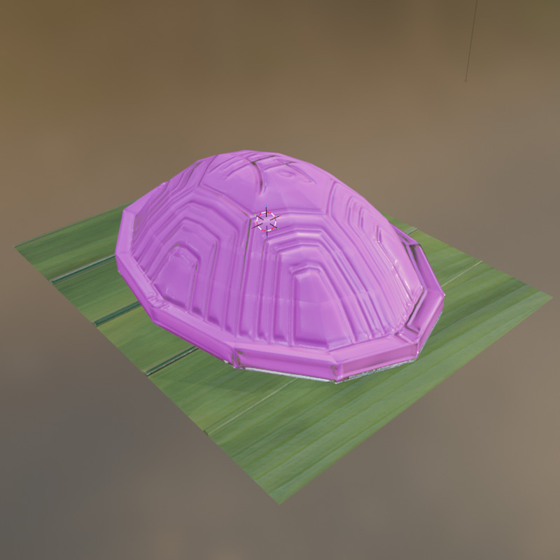
3D model of Ang Ku Kueh from Sketchfab
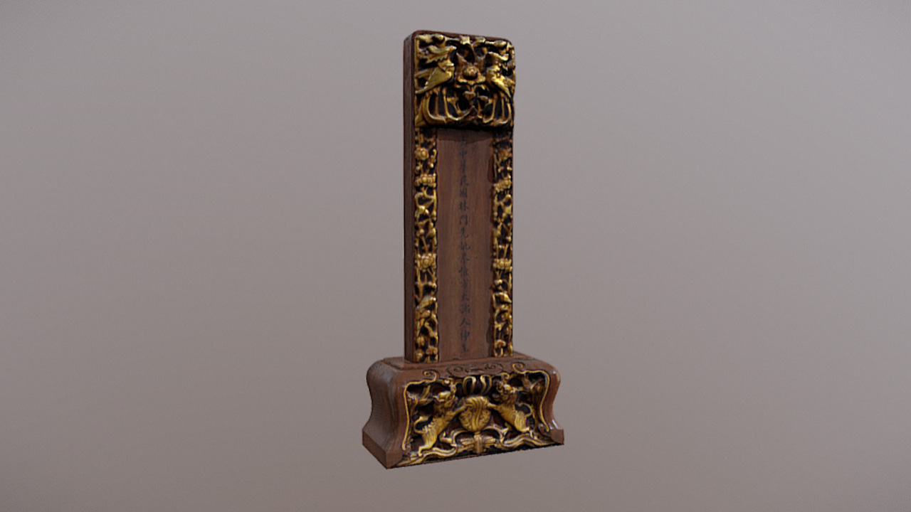
3D models of Sin Chew, Ancestral Tablet
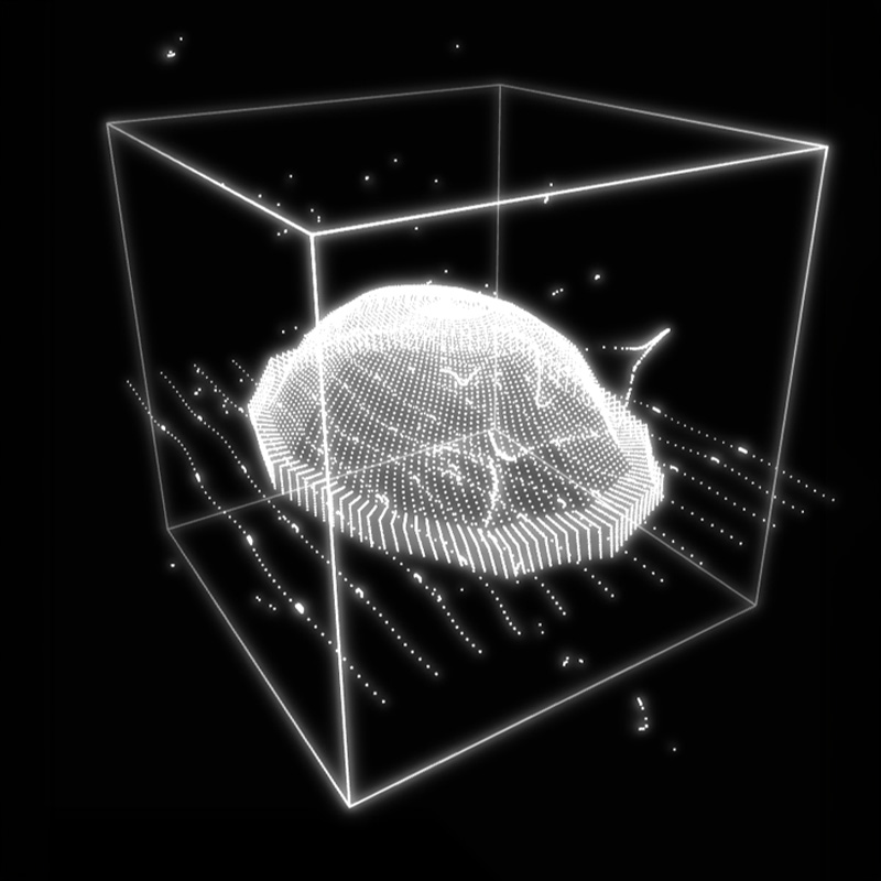
With the 3D models downloaded and ready, I imported the models into TouchDesigner and used its 3D data to create its point cloud representation. It was a straightforward process, where I firstly imported the 3D model into TouchDesigner with a File In POP, then applied a Particle POP to it to create the point clouds before adding a Geo COMP + Render TOP to render it.
3D model of Ang Ku Kueh from Sketchfab
3D models of Sin Chew, Ancestral Tablet
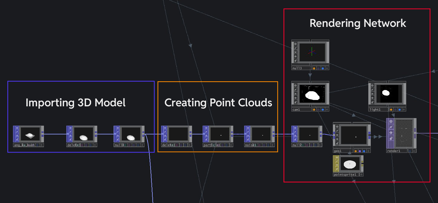
The node network for the visual
Looking at the current visual outcome, I feel that it there are still plenty of room for improvement. The biggest issue here is that the visual outcome serves as an inaccurate representation of the artefact due to two main reasons.
Color is an important identifier of a object/artefact. When we learn about what an object is, we often remember its color to help us register what it is. The current visual outcome lacks the true representation of the artefact's color, thus failing in this regard.
Similar to color, texture is also an important identifying element. By relegating the 3D model into a point cloud outcome, I have lost all the identifying textures that was once present (i.e the protrusions within the Ang Ku Kueh).
Viewed collectively, these issues have made it harder for participants to learn about the true form of the artefact and affects their learning of the cultural heritage. Therefore, the next visual exploration for me is to utilize the 3D model itself as the final visual and figure out ways of presentation that can make it more visually interesting.
I began the iteration process by figuring out how to render the actual textured 3D model within
TouchDesigner. I imported the FBX file of the 3D model of the chosen Peranakan artefact (in this case,
the Ang Ku Kueh). This time, I imported it through a FBX COMP, which is a component that houses all
the 3D model data. At the first import, the 3D model lacks the colors and textures that was present in
its original design, which I had to fix by manually importing the UV texture, roughness + normal maps
and applying them to the 3D model as a Material MAT. After integrating the textures, I finalized the
render by adding a Render TOP to materialize the model digitally.
I decided to keep the point
cloud visual I created, but repurpose it as a visual "Wireframe" effect that appears during the
appearance of the 3D model and fades away when the model is fully materialized. Looking at the
outcome, I am actually quite satisfied with it as it gives it a fun visual punch due to the wireframe
effect and also serving as a accurate visual representation of the real artefact.

3D model before UV/texture mapping
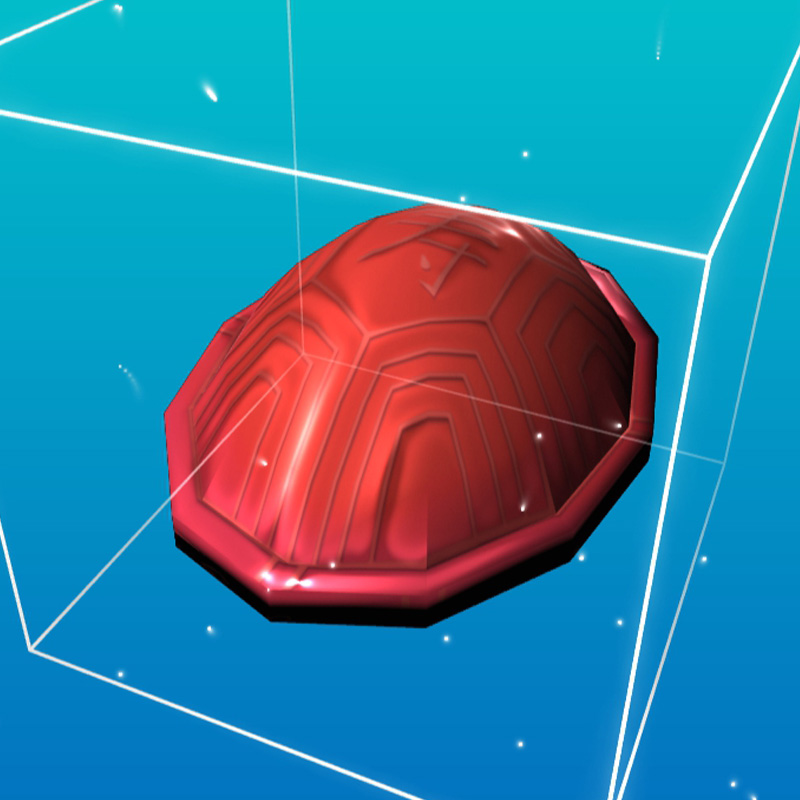
3D model after UV/texture mapping
-
Repurpose point clouds as a visual effect
With the visuals in place, the next step is to create the physical input interface. The interface will consist of 3 main components listed below. For this week, I will be creating paper mockups first to do a functionality test first.
4x4cm square tiles with a design inspired by Peranakan tile motifs, each with a syllable on its face and a NFC tag embedded within.
A platform where users place the tiles on top, that also houses the Arduino NFC scanners within them.
Two NFC scanners that detects the data within the Language Tiles, with its data relayed to TouchDesigner.
I used the same generative tile design that I did for the previous prototype's platform and added baba malay words onto each of the tile's faces. To help pronunciation, I added syllables at the bottom of the words. It was quite a straightforward process to build this which is great because it allows me to test quickly!
-
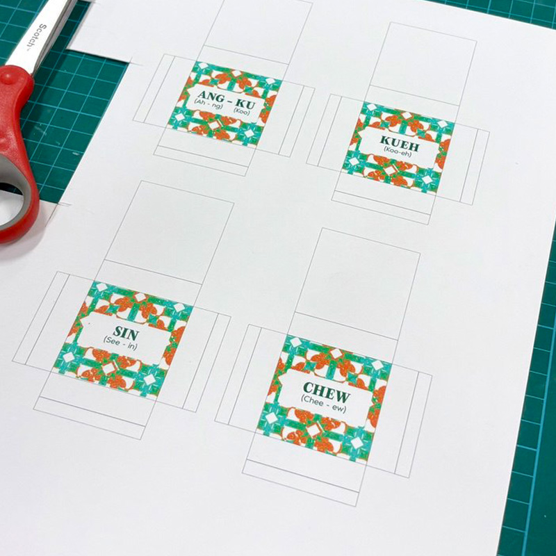
Paper templates to be folded into tiles
-
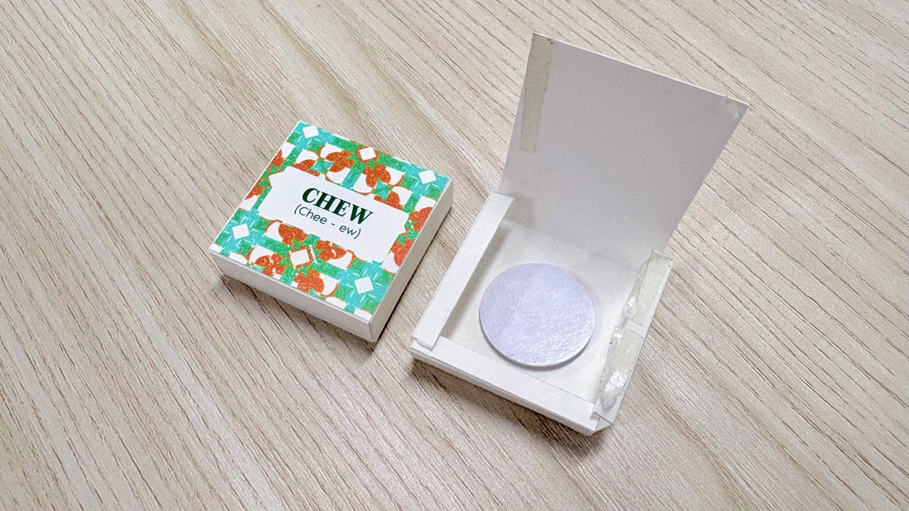
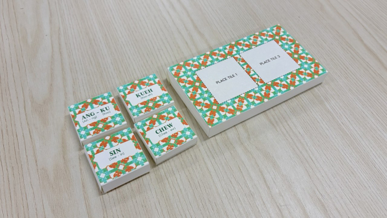
Final outcome of paper prototypes
I moved on to test the functionality of the language tiles to see if I can get Arduino to detect the different tile inputs. I attached two NFC readers into my Arduino set-up and wrote different numbers into each of the NFC tags (Ang-Ku = 3 and Kueh = 5 etc). Hence when scanned, each tile produces a unique numeric value which serves as their identifying ID. I used Gemini AI to help me code the Arduino code to initialize the NFC readers and serial print the IDs of the different tiles.
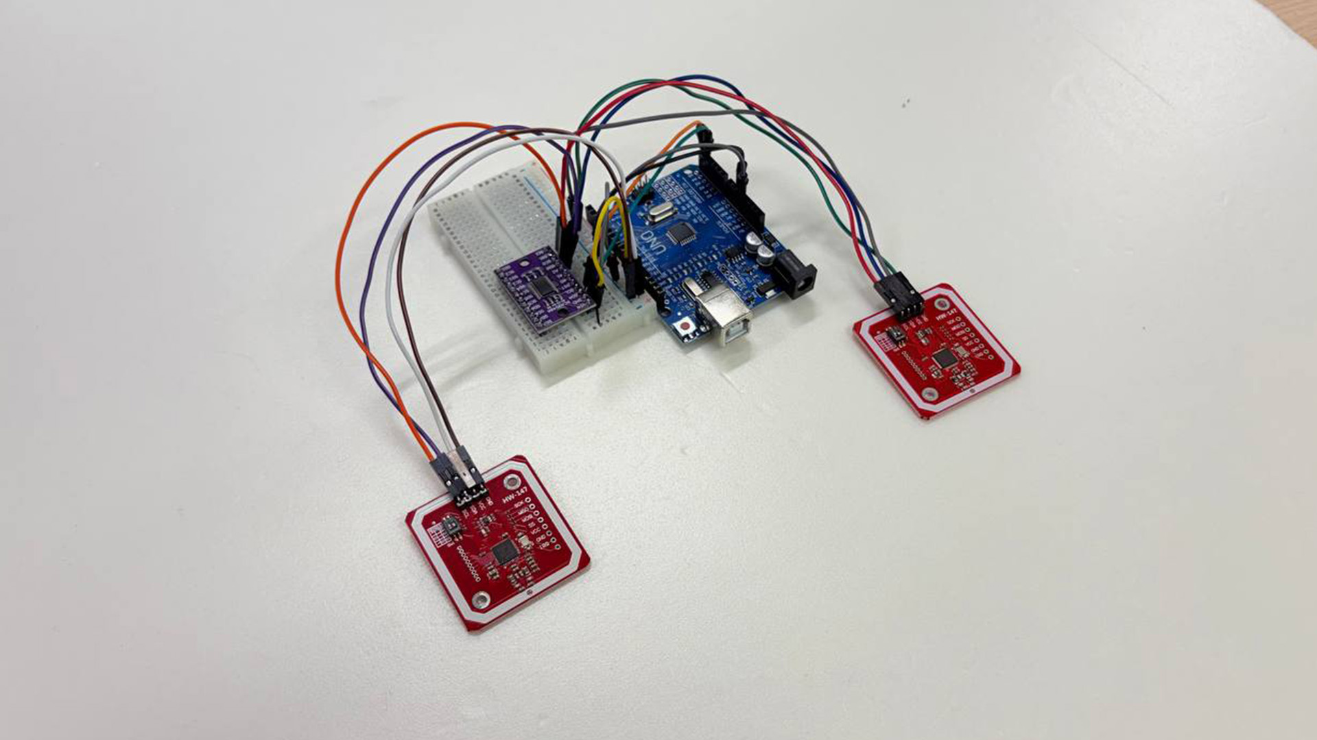
NFC Arduino set-up
-
Scanning paper tiles that serial prints numeric ID